Visual Data – Truth or Dare
For all you graphic data nerds out there (and I freely admit I stand among you), a few thoughts on statistics. Perhaps a good starting place – correlation.
Correlation is the way fluctuations in measurement of separate variables or outcomes match up. Like the way we keep seeing cigarette smoking correlating highly with lung cancer. The problem with correlation – or perhaps better said, the inherent limitation – is that correlation alone may never mean causation. Take, for example another numerically defensible correlation, the one between children’s gains in height and reading skill. A relationship upheld by the data, but, spurious (always love it when I get a chance to write that word).
Correlational statistics, like all other statistics, are powerful. But like every other application of statistics, correlation is just that – a tool and not the truth. Nonetheless, numbers can be vastly helpful for guiding our next questions about matters urgent to the wellbeing of humans and the world in which we live.
In recent decades, cyber-technology has catapulted graphic data into sophisticated and nimble renderings. Like, the way statistics related to weather may be mapped and immediately applied; for example, by firefighters faced with calculating the best moves for battling wildfires. Almost anything can be mapped. Based on past and current measurements prediction models emerge for things as diverse as climate, economy, life expectancy, soil viability, the lifespan of a country’s infrastructure.
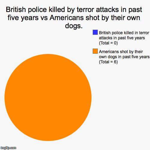
Today, I ran across this blog, The Power of Pie Charts. It’s mostly visual. And it invites consideration of the limitations and power of numbers. Another thing it does is show the power of visual data.
You can see what you think.
I’m left with familiar awe and humility in the face of – well –
- The limitations of language, including numbers – every single bit of which can be no more than abstraction,
- The potential for each to be used toward wisdom or toward manipulation,
- The ambiguity of motive and effect – i.e., as imprecise as these abstractions are, how can clear communication ever occur?
Statistics and their compelling rendering in graphics. They no doubt play in the furtherance of wise education. They call, in ways too often unheard, for humility in the face of all we do not know.
They are tools – not the truth. Statistics – visual data – numbers in general may also be a dare. A dare to apply them for thinking, for learning, for building capacity to reflect well on where we are, and where to go next.